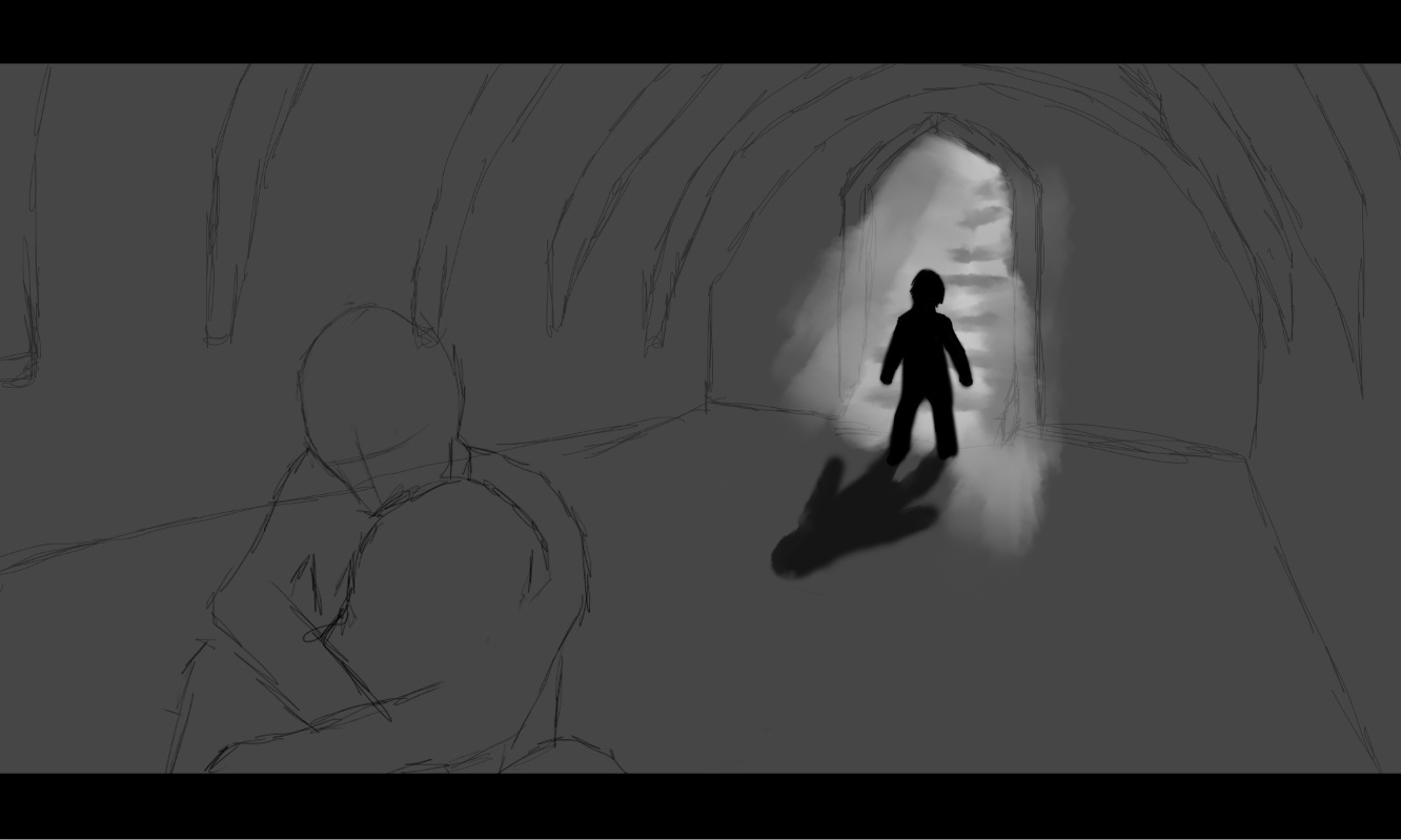
This is the first digital painting I have completed for our game, to help us determine what art style we want to go for. We knew that we were going for a graphic novel style, so thick lines, and we also decided on going for black and white with one colour standing out, to give a totally unique feel to the art style. This is the opening scene in the game where Jason finds his ex wife and daughter dead on an investigation.
Progress Images:
This is the final four images I came up with, each with different colours used to give a different feel.
In the end this is the final image I created.
I decided not to have the black border as I like the unfinished surrounding it has to it. For the art style we have decided to go for this style,
bold lines as well as drawn scruffy lines, and strong lighting. We really love the
water colour look to the image, and this is something we would love to see in our games art style. We have decided to keep the colour
yellow in colour in our game as its connotations fit perfectly into the theme of our narrative. The connotations of the colour yellow are conflicting ones, as on one hand it
connotes happiness, and on the other connotes cowardice and deceit. It is also the colour used for hazard signs and warnings. Also, yellow ribbons were worn as a sign of
hope as women waited for their loved ones to return from war. They are also still used nowadays to welcome home loved ones. This is perfect for our story, as it is centered around
deceit and the importance of family and loved ones.


No comments:
Post a Comment