First Step
My first step was collecting many reference images to work from. This is my collection:
Environments:


.jpg)

Extras:


Horse and Rider:


Second Step
My next step was creating the landscape/environment that I wanted the picture to convey. As this was my first image I wanted to create something a bit simple and vast to get me into the style I want to use. I choose a desert landscape based on my theme. I then created some choices as to the layout of the image.
Image 1
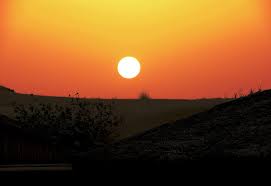
Sand Dunes in Midday
This empty landscape would basically set the scene, and give a sense of isolation and loneliness.

Camp on the Dunes at Sunset
I wanted to experiment a bit with the lighting, as sunset in a desert can create some beautiful colours. This is my idea of the player camp site.
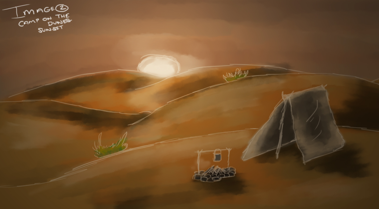
Image 3
High Dunes at Sunset
This is one of my favourites as the different heights of the dunes gives a lot of depth to the image, and with the sun setting over them, it can create dark shadows giving a sense of urgency from the night.

Image 4
Steep Dune at Midday
This idea was to also experiment with silhouettes and lighting, with the steep dune giving struggle to the image and conveying hardship for the character.

I then began on some pre-production images, such as characters on the image and other, smaller objects. My first step was putting together some silhouettes of the horse and rider,so I could choose as to which would look best.
Horse and Rider Silhouettes
These are of the rider on horseback in different gaits, walk, trot, canter and gallop and from different angles.

These are silhouettes of the horse and rider both on the ground in different poses, standing together, sitting as well as walking together.

Desert Plants and Camping Equipment
I conducted some research into desert plants as well as western camping equipment, and put together some sketches of possible plants and equipment I could use in my image.

Rider Equipment
I then realised that the riders equipment must have to be looked into, so some research into 'Red Dead Redemptions' John Marston was conducted.

Then, using my landscape images and my silhouettes I put together some mock up images for positioning.


After deciding which one to pursue, I began finding more reference images and making an initial sketch.
My Chosen Image
I chose this one as I felt I could get a sense of urgency in the character, showing a danger on night time in the desert. I wanted to create an image with strong lighting and shadows and this positioning was perfect.

My Initial Sketch
This is my initial outline for my image, this was created by combining reference images as well as my previous mock up. As you can see it has been more refined and expanded from the initial mock up.

Then began the task of colouring the image.
Stages of Colouring and Technique
From the initial sketch, I made a new layer for the background and began painting it in block colours. Using a palette of different shades found in my reference images, I mixed in different shades on both the sand and sky and smudged using a special brush.
Sky:

Sand:

From this stage I began on the horse and rider, block colouring them to get the base colour. Tone and shadows would be added later on.
Horse Block Coloured:

Both Horse and Rider Block Coloured:

Using Black for Tone:

Using White for Shine:

Adding More Detail:

Without the Lines:

I then used the same technique for the rider, block colouring in the main colours then I used black and white to create shadows and shine. There was quite a bit more block colours to put into the rider as there is a lot more detail on his clothes.
Block Colour:

Rider with Shadows and tone:

I then needed to put tones into the sand and sky, as well as detail and shadows. Using darker colours from my palette, I created the shadows and tone given on the sand to give depth and a sense of lighting. Also, using a special brush I created a splashing sand effect from the horses back legs to give movement to the image. After this, I added some more tones and colour to the sky, giving more colour and life to the picture.
Tone and Shadows on Sand:

Tone and Colour on Sky:

Finally the image needed lighting. I experimented with a few lens flares, but decided on one. I first tried without any lighting effects on it to see what this looked like. After deciding it was too light for what I wanted to come across, I tried some lighting effects out on the image, as well as different colour tones etc.
No lighting effects, with Lens flare:

After having a discussion with my course leader and viewing the image on the screens at Uni, I can see that this image looks the best on the screens, as any darker you would lose detail. Also, after getting my learning agreement back my tutor does not want me to focus on Red Dead Redemption, and make it my own. Therefore, I am going to conduct some research and come back to this image to change it slightly.

No comments:
Post a Comment